For 56 years
We have been operating in a structure built in the 1890’s.
As stewards of this historic landmark, we are launching a capital campaign to restore and preserve this community gem for decades to come.
pledged or donated of $400,000 goal.
$80,000
Our Mission:
Tampa Regional Artists is a 501(c)3 non-profit organization dedicated to promoting artistic excellence and art appreciation by providing a permanent gallery space for education, exhibition opportunities, outreach activities and fellowship for artists and the Tampa Bay Area community.
Follow Us
OPEN EXHIBITION CALLS
Featured


UPCOMING EXHIBITIONS
We are hard at work planning our 2026 Exhibition Calendar. Stay tuned!
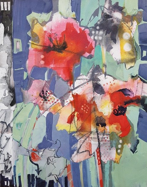
Eat, Pray, Love
Our current gallery exhibition.


Latest News
Featured


